
First impressions matter – and for online video, a strong thumbnail is your first impression. In this article, we’ll lay out 7 examples of great thumbnails and break down why they’re effective:
1. Crafty Girls – Twin Telepathy Slime Challenge
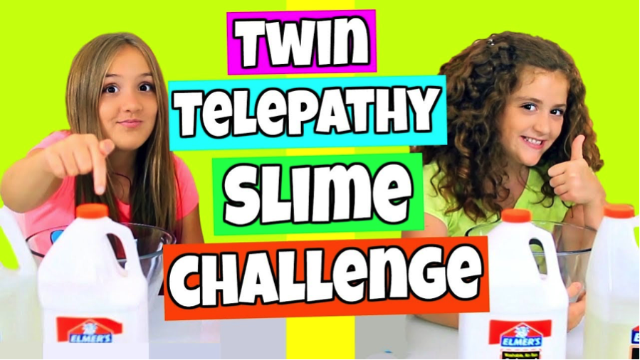
The Crafty Girls are one of YouTube’s best slime channels, and their thumbnails are always fun, colorful, and expressive. This thumbnail, for a “twin telepathy” challenge (starring real twins!) particularly stands out for it’s bright colors. The lime green background jumps off the homepage and catches the eye. The neon background colors behind the text helps illuminate the words, and also gives a fun vintage gameshow feel. Additionally, the text is white with a black stroke around it – a tried and true technique to make text pop no matter what color is behind it.
Another effective aspect of this thumbnail is the layout – splitting each girl to her own side and adding a bar down the middle to show that they’re going to be doing the challenge individually helps reinforce the idea of “telepathy” and illustrates the idea of the challenge.
What You Can Learn: Creative framing and bright colors can illustrate the fun, game like nature of your challenge video. White text with a black stroke will make your words legible and clear no matter the background color or pattern.
2. Good Mythical Morning – 100 Years Of School Lunches
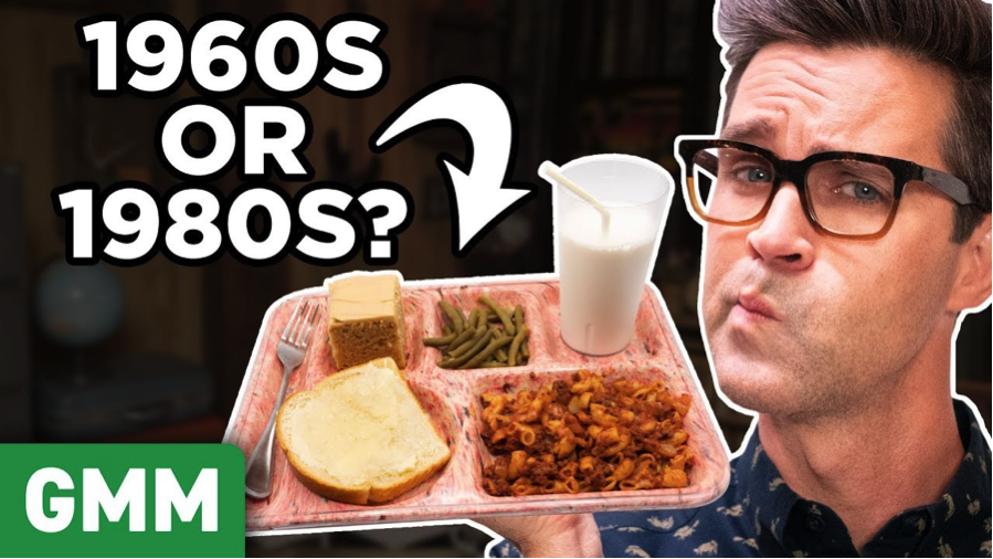
Good Mythical Morning is one of the most popular shows on YouTube, starring two of YouTube’s original stars, so naturally, they have thumbnails down pat. By adding their logo in the bottom left corner, they’re letting fans of the show know what type of video it is. Although this one doesn’t have a brightly colored background, the images still pops on the screen due to it’s large size, and the white highlight surrounding the image. Like the first example, note that the text is white with the black stroke around it, but also pay attention to the actual content of the text. By posing an easy to read question and adding a graphic arrow, the thumbnail invites viewers to click and discover if they’re right.
What You Can Learn: Don’t be afraid to add your branding to your thumbnail. Use large, bold graphics to catch the eye. Invite your viewers in with an easy question they can answer quickly.
3. EvanTube HD – Mystery Wheel of Cake Challenge
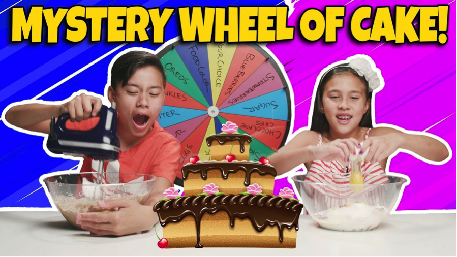
When you look at this thumbnail, there’s no doubt about what it’s about, who’s competing, or how this challenge works. The two brightly colored backgrounds illustrate who’s competing against whom, while the wheel and the cake in the middle add more visual indicators about the challenge. The two images of Evan and Jillian are also fun, active images. Using photos of them with the mixing bowls as opposed to their final cakes also helps keep the outcome of the challenge a surprise.
What You Can Learn: If you’re doing a trendy challenge like a mystery wheel, make sure that it’s clearly presented in your thumbnail. If you don’t have a staged photo, you can still make a good thumbnail with a screengrab as long as the photo has lots of personality.
4. SciShowKids – The Terrifying Truth About Bananas

This thumbnail perfectly illustrates how to use shock value and comedy to engage and entice viewers. Aside from the bright colors and easy to read font, framing bananas as something to be afraid of is an absurd enough idea that it makes viewers laugh and stop scrolling. Another interesting thing about this thumbnail? There are no bananas! It would be easy to add a photo of bananas or even make the picture yellow, but by having NO bananas in the frame and instead making the thumbnail a busy photo with a lot of leaves, you kind of get the impression that bananas are scary and mysterious – another comedic idea.
What You Can Learn: Be clever with your captions – adding unusual adjectives instantly changes the concept of a thumbnail. Also, don’t be afraid to use an unusual photo for your background if you think you can make it work.
5. Behind Tasty – Giant Raindrop Cake
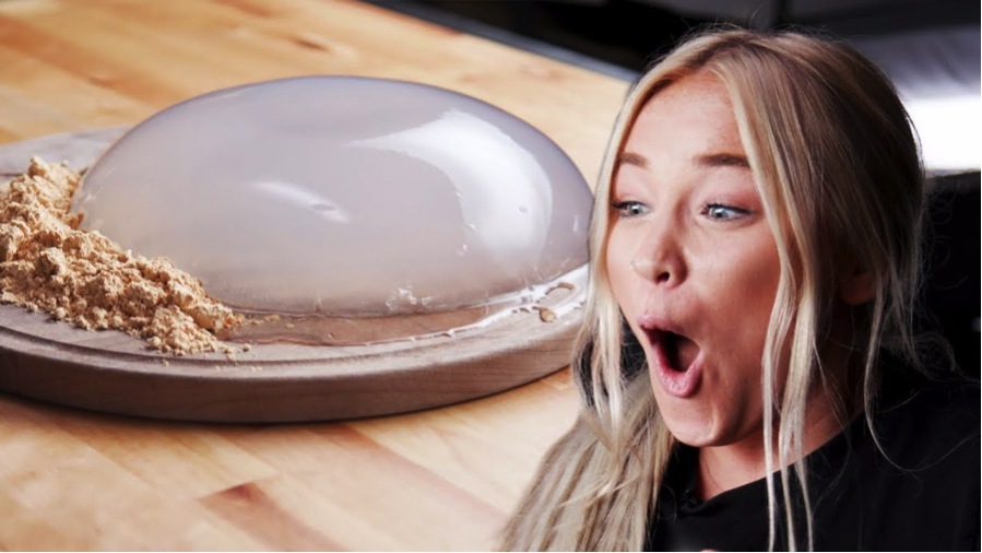
This is a great example of how you don’t always have to use text on thumbnails. Thumbnails are important real estate, but don’t forget that you also have your video title to help describe your video. This thumbnail features two great, distinct large pictures that definitely would have been obscured by additional text. By using a funny face picture that captures a lot of emotions, the thumbnail still has plenty of personality that communicates the fun, informative nature of the video. That’s not to say that there still shouldn’t be any editing, you can up the brightness and contrast, or superimpose images together to create a fun, eye catching image.
What You Can Learn: Pictures are worth a thousand words! Don’t feel like you need to crowd your thumbnail if you think your pictures can tell the story for you.
6. New Toon News – New Blues Clues Host
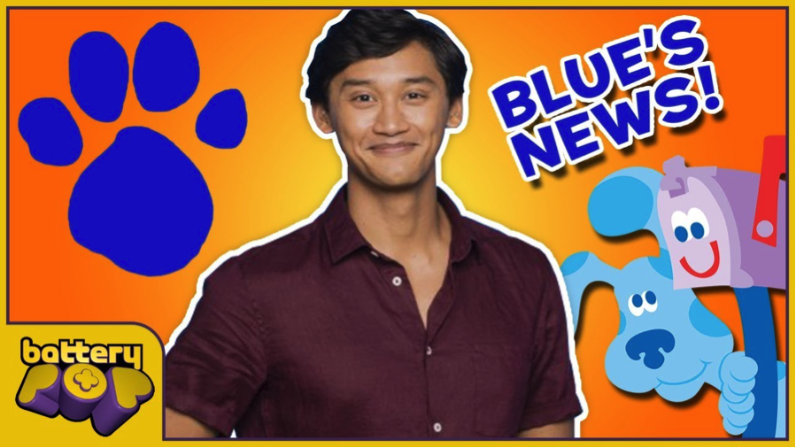
If your video is newsworthy, using images related to the announcement is an obvious route to success. This example plays up both the iconography and new information related to Blues Clues. By using a familiar image of Blue and Mailbox coupled with an image of an actor you’re likely unfamiliar with, you’re enticed to click to find out how the two are related.
What You Can Learn: Playing with familiar and unfamiliar images is a great way to get viewers invested. Their eyes will be drawn to the familiar image, but by pairing it with new information, you’re asking the viewer to find out more.
7. BlackNerdComedy – Isabelle in Smash Bros Ultimate!

Reaction videos are a popular format for gamers and pop culture fans. This thumbnail is great because it capitalizes on the YouTuber’s personality, and the exciting news about Isabelle from Animal Crossing being in the new Super Smash Bros Ultimate game from Nintendo. His facial expression is extreme and gives clear indication of his excitement, which is always enticing to potential viewers. He’s also capturing several demographics of fans: his current subscribers who want to see him; fans of Nintendo who are looking for news about the announcement; and fans of Animal Crossing and Smash Brothers who are looking for a place to celebrate this news.
What You Can Learn: Showing personality is always a good idea in a thumbnail image, but by combining it with a topical image you can capture new fans who are looking for news and fellow fans of a product.